Revealing the Logo
I really put in the work to find the perfect typefaces that would portray the desired tone of Inimitable Alchemy. By combining two fonts: The Seasons and PF Marlet Display, I perfected the wordmark logo. For a little touch of fun, some packaging features a simple potion vial. To the left are two mockups of what the packaging for various projects the brand would offer could look like.
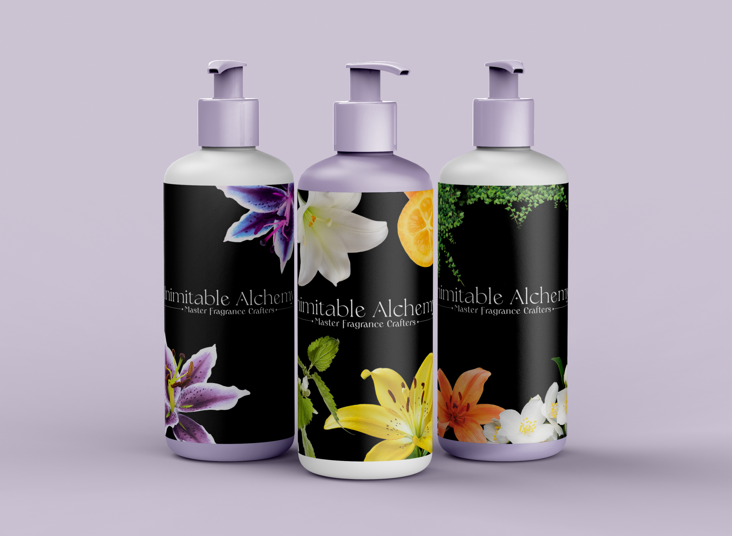
Packaging Mockup
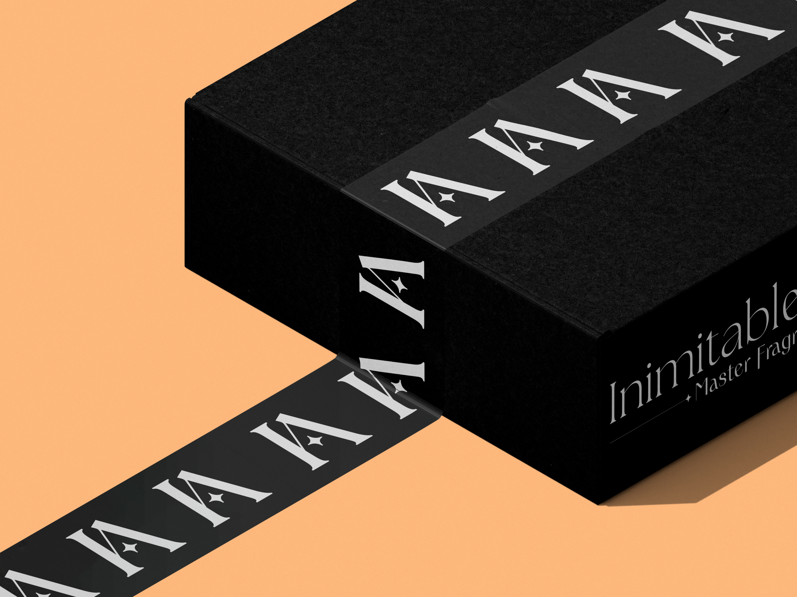
Lettermark
For parts of the brand that would require something smaller to be easily identifiable while keeping the sleek, magical feel, I condensed pieces of the full logo to create this lettermark symbol as an alternate logo piece.
Packaging Mockup
Signature Scent Line
Inimitable Alchemy features a signature scent line in addition to the personalized fragrances offered by the brand. Here I have mocked up what the catalog would look like as a 7x7 booklet. I used Adobe InDesign to create this piece and Photoshop to mock it up.

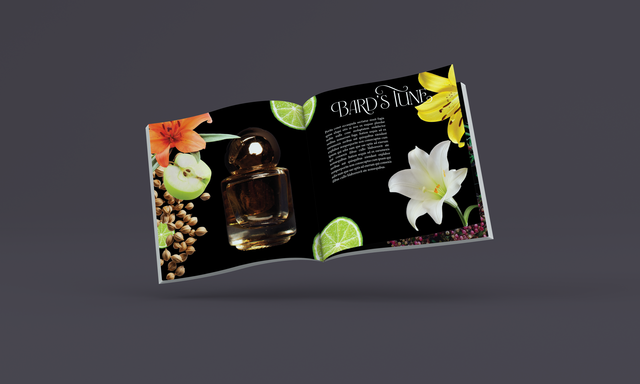
What's Inside
This is just a closer look at what the inside of the catalog would look like with full content. I used Photoshop to cut out each ingredient image to create a collage on each page of the scent notes for every signature scent.
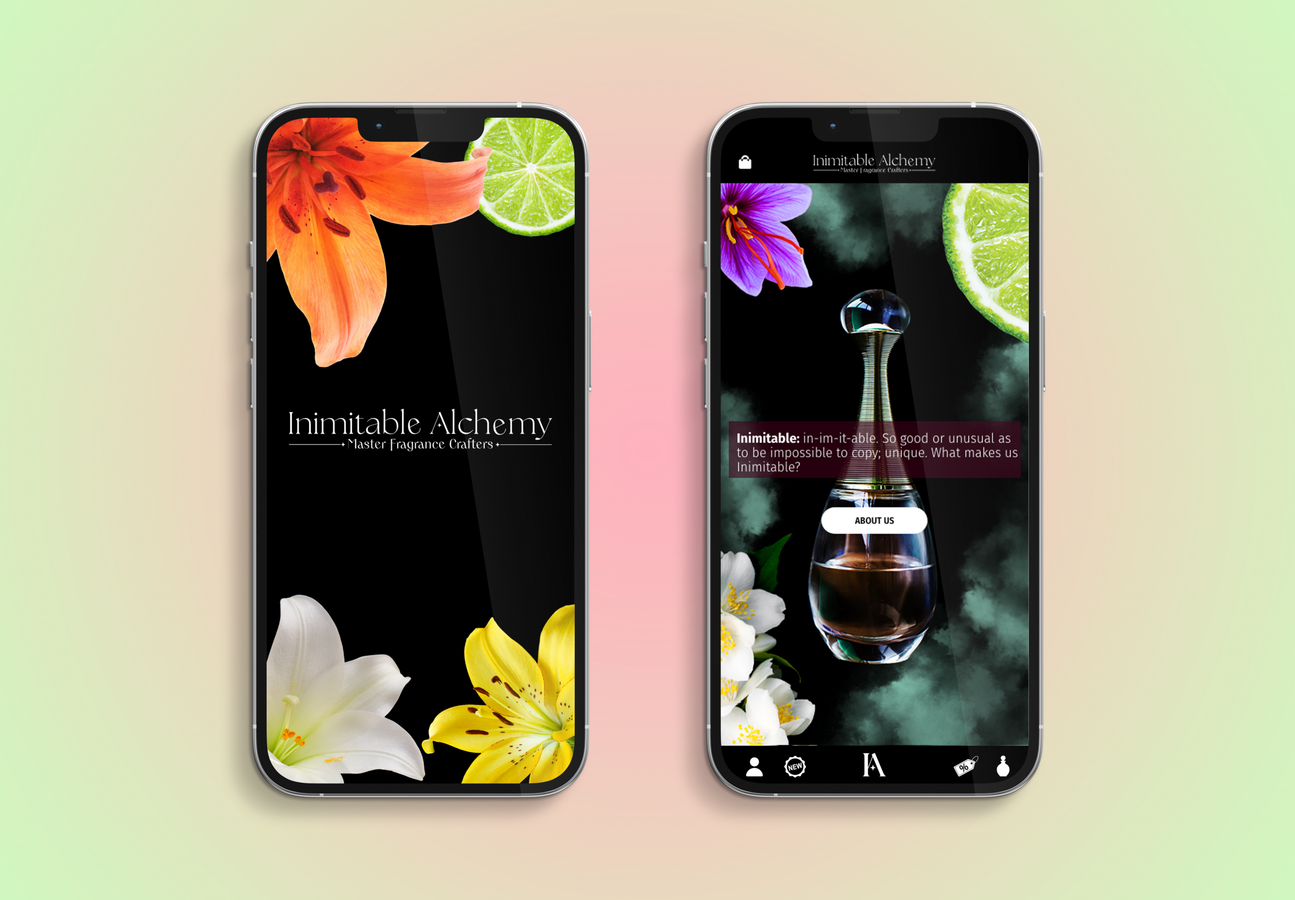
The Inimitable App
Every good brand has a beautiful and easy to use app--so that's what I've created for Inimitable Alchemy. I used Adobe Xd to prototype the interactivity of the UI to demonstrate how the app would flow for the user.
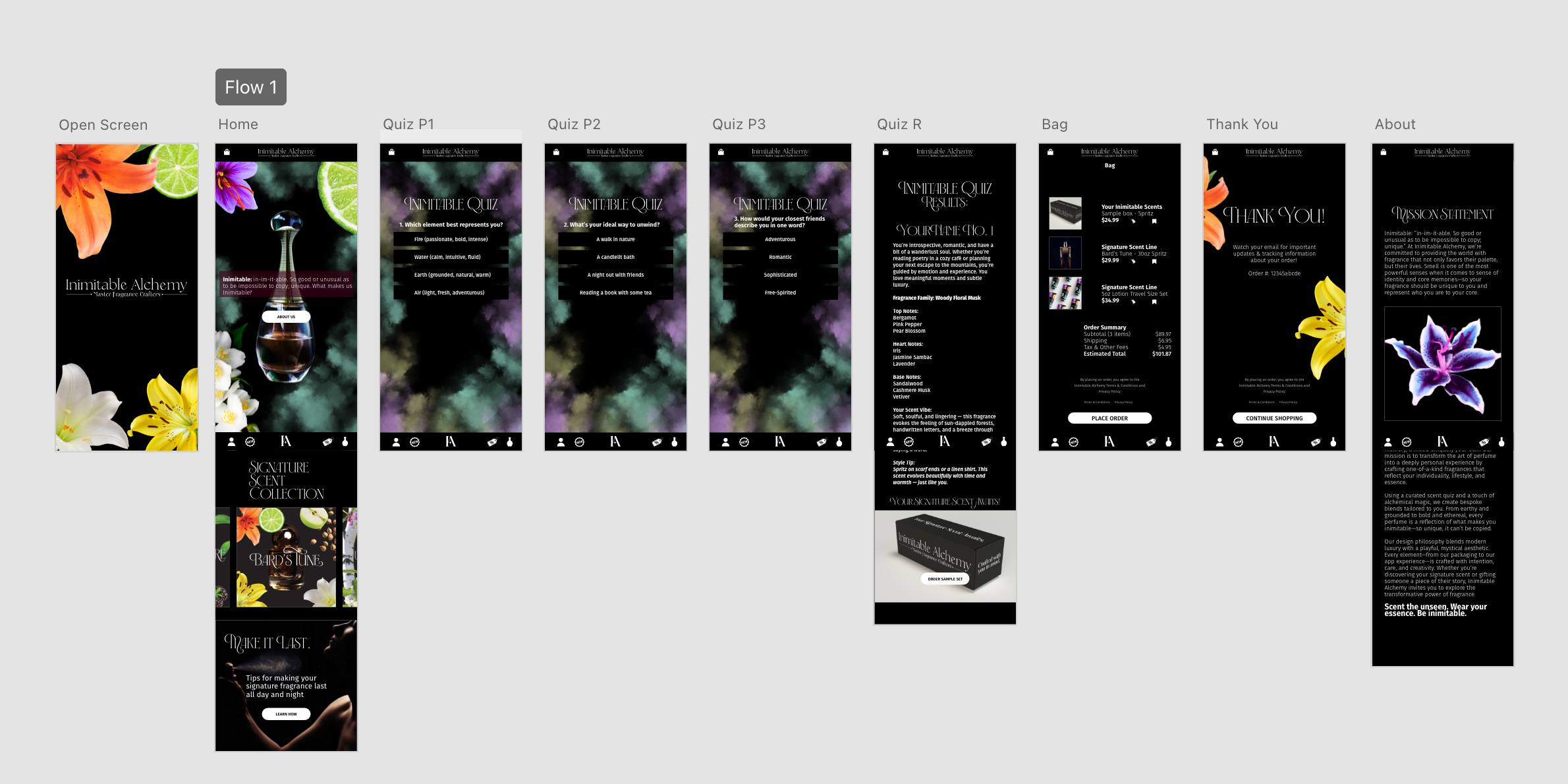
The Inimitable App (cont.)
This is how each page of the app looks while spread out. Included are the splash screen, the Home Screen that scrolls, a few sample questions for the quiz, results, shopping cart, and of course the thank you screen.